Configuration
This guide walks you through configuring PrestaBlog: theme selection, blog homepage settings, global configuration, block and category management, articles on homepage, image sizes, colors and design, comments.
Theme
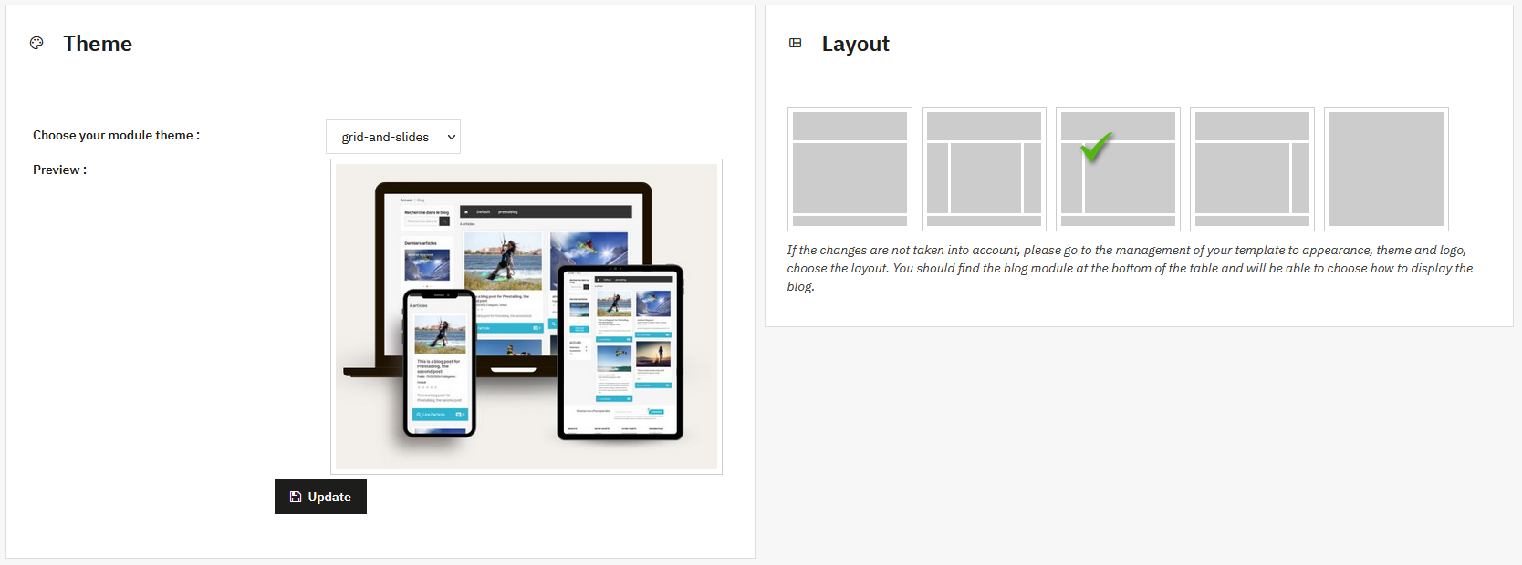
This section allows you to choose the graphic theme used by PrestaBlog.
For a new installation, no particular settings are required. The default theme Grid & Slide is recommended. It is the most recent template, integrating the latest design evolutions with the use of slides for many blog elements (blocks, homepage, etc.).
The Grid for 1.7 theme corresponds to an older design. However, it remains fully compatible with PrestaShop 8 and PrestaShop 9 and the new options offered by PrestaBlog.
The right side of the screen allows you to select the theme layout. Simply click on the desired layout to apply it. The options provided only affect the visual layout of the entire blog and can be changed at any time without impacting data or the rest of the shop.
Theme not applying?
Go to Design > Theme & Logo, then choose the layout. You should find the blog module at the bottom of the table and can choose how to display the blog.
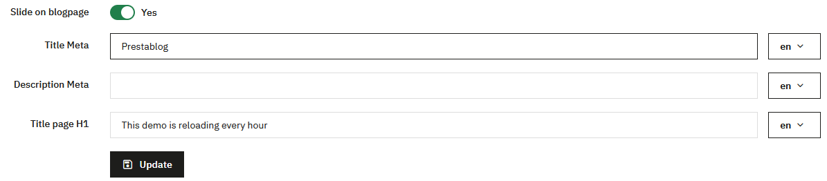
Blog Homepage
This section contains settings related to the PrestaBlog blog homepage.
The first part concerns the general homepage configuration. You can define the meta title, meta description, and H1 title. All these fields are configurable for each language, allowing you to properly adapt the content and SEO according to the site language. You can also enable or disable the slideshow display.
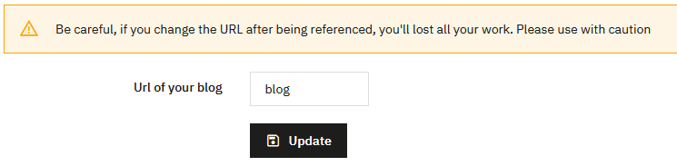
Blog Homepage URL
A second part allows you to configure the blog homepage URL. This URL can be freely customized. You should only use simple characters, without accents, spaces, quotes, or special characters.
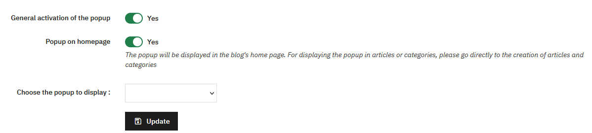
PrestaBlog Pop-up
The PrestaBlog pop-up system is activated from this page or on the global configuration page. You can enable or disable the pop-up system. When the pop-up is not in use, it is advisable to disable it to avoid loading unnecessary scripts on blog pages. This lightens the load and optimizes performance.
If the pop-up is enabled, you can choose whether it displays on the blog homepage and select which pop-up to display. You will first need to have created a pop-up via the popup management page.
Articles on Homepage
This section is a shortcut to the custom list. You can add a section on the homepage that displays homepage articles. You will find it directly in the configuration > blog homepage tab.
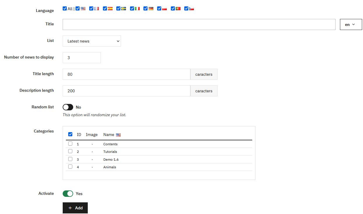
- Add a title (for example: "Our latest news"). It will appear above the list.
- To maintain consistency, avoid titles or descriptions that are too long to limit content duplication.
- Choose which categories to display, with a random display option.
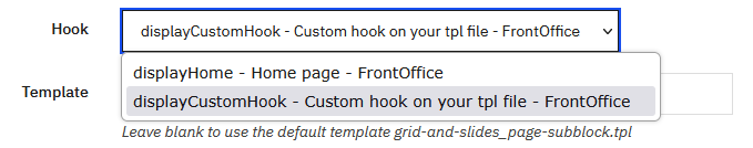
Your template doesn't use the displayHome hook?
If you use AppBuilder, Creative Elements, etc. and the news doesn't appear on your homepage, go to Content Management > Custom Lists > Edit the homepage list > Change the "hook" part by selecting displayCustomHook.
Validate, copy the code (example: {hook h='displayPrestaBlogList' id='1' mod='prestablog'}), then add it via a code block or directly in a tpl file of your template.
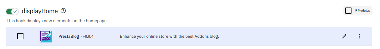
If you want to change the position of this block relative to another, go to PrestaShop's position management in Design > Positions. Search for the displayHome hook, locate PrestaBlog, and move it by dragging and dropping the block to the desired position.
Global Configuration
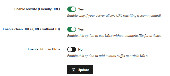
URL Configuration (rewrite)
This part allows you to manage the blog's URL structure.
You can enable or disable friendly URLs. In most cases, this option is enabled, provided the server allows URL rewriting.
Once friendly URLs are enabled, an additional option appears to remove numeric IDs from article URLs. This option is only available if rewrite is active.
After removing IDs and validating the configuration, another option becomes available to add the .html suffix to URLs. It is not possible to enable .html if numeric IDs are still present in URLs.
Front Office Configuration
This part concerns the blog display on the visitor side.
The options allow you to:
- display or hide the breadcrumb on blog pages
- display the thumbnail in articles
- enable previous/next navigation on article pages
- display a link to the category RSS feed
Hide the Blog link in the top menu
An option allows you to show or hide the "Blog" link in the top navigation bar. By default, if this option has never been saved (for example after an update), the link is displayed.
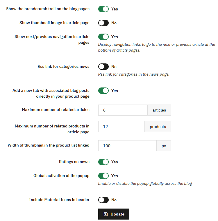
You can also add a tab on product pages listing related blog articles. This option allows you to control whether links to blog articles should appear on product pages.
This allows for SEO strategies where the blog can link to products without systematically displaying return links from product pages to the blog.
Other options allow you to define:
- the maximum number of associated articles on a product page
- the maximum number of associated products on an article page
- the thumbnail size of related products
- the display of article ratings
The global activation of the pop-up system is also present here. If the pop-up system is not used, it is recommended to disable it to avoid loading unnecessary scripts.
An option finally allows you to add Material Icons in the header. It is useful for some themes that don't fully follow PrestaShop recommendations and don't properly integrate this library, resulting in icons not appearing on the blog and showing names instead.
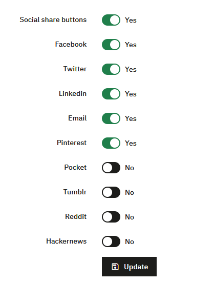
Share Buttons
This section allows you to enable or disable the display of share buttons on blog articles.
You can choose precisely which social networks should be displayed.
If you want to change their color, go to configuration > design > share buttons. (see the design section)
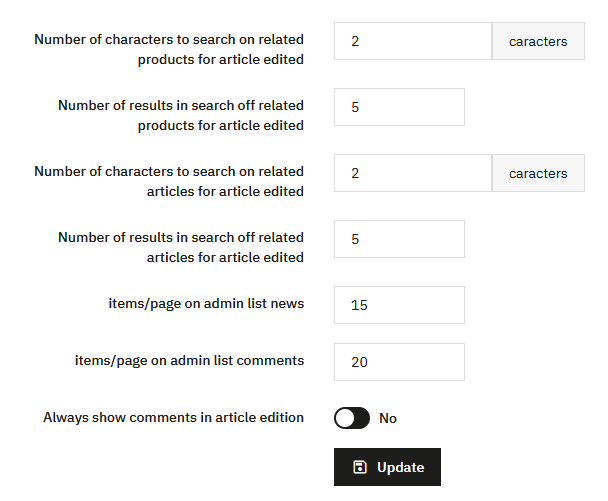
Administration Global Configuration
This last part concerns only the back-office.
It allows you to define:
- the number of characters required for search fields when associating products or articles
- the number of results displayed per page for these searches
- the number of elements displayed per page in article and comment lists
- whether comments are automatically displayed when editing an article
These settings are intended to refine the comfort of using the administration. They have no impact on the front office and generally do not require any particular modification.
Blocks
PrestaBlog blocks are displayed in the left or right columns of the theme, when they exist. Their position depends directly on the structure of the theme used.
Block placement is done by drag and drop. This action is only possible if the theme actually has columns. If the theme doesn't provide columns, blocks cannot be displayed there, even if they are enabled.
This behavior depends only on the theme and not on the module.
Article Search Block
This block allows you to enable or disable blog article search.
You can choose between a simple search that directly displays articles, or an advanced search with filters.
An option also allows you to display or hide the search icon in the menu.
Latest Articles Block
This block displays the latest blog articles.
Several presentation options are available, including displaying the introduction or thumbnails. The rendering depends on the chosen design.
It is advisable to visually test the different options to adapt the display to the theme used.
Articles by Date
This block displays articles by date, as archives.
It is rarely used in most configurations but remains available for sites wishing to offer chronological navigation.
Latest News in Footer
This block displays recent articles in the site footer.
You can display only titles or add thumbnails and text.
For readability and SEO reasons, it is generally recommended to limit display to titles only.
RSS Block
This block displays a link to the blog's RSS feed.
It is intended for users wishing to offer direct access to the feed, without any particular configuration.
Categories Block
The categories block is configured from the Configuration > Categories section.
Hide blocks on specific pages
By default, PrestaBlog blocks (left column, right column) are displayed on all pages of your shop. If you want to display them only on blog pages, you can add position exceptions to exclude the pages where the block should not appear.
Steps:
- From the PrestaBlog administration, click the "Hook points" button located at the top right of the screen. This redirects you to the PrestaShop position management page.
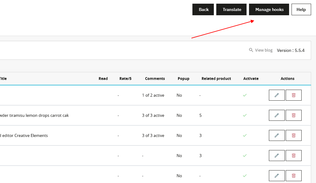
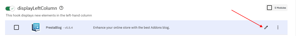
- Find the position "displayLeftColumn" (left column) or "displayRightColumn" (right column), then click the Edit icon (pencil) next to the PrestaBlog module.
- In the Exceptions section, select from the list the pages where the block should not be displayed. You can select multiple pages by holding the Ctrl key while clicking, or select a range of consecutive pages with Shift + click.
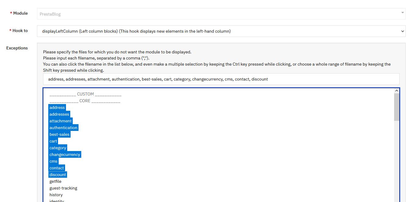
- Save to apply the changes.
Tip
To display blocks only on blog pages, select all PrestaShop pages (address, cart, category, cms, contact, etc.) in the exceptions. Only blog pages, which are not in this list, will continue to display the blocks.
Categories
Category configuration is really the heart of blog design. This is where you generate the design you want to represent.
Main Settings in Category List
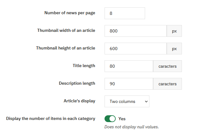
You choose the number of articles per page. If the display is in 2 or 4 columns, an even number is advisable. With 3 columns, an odd number is preferable.
The width and height of the article thumbnail are configured by default at 800x600, but you can modify these dimensions according to the desired proportions.
The title length and description size allow you to define how many characters are displayed. If a value is set to 0, the concerned element is no longer displayed.
Article display can be set to 1, 2, 3 or 4 columns, or in full picture mode to highlight large images.
You can also choose whether to display the number of articles in each category.
Article List Display Settings
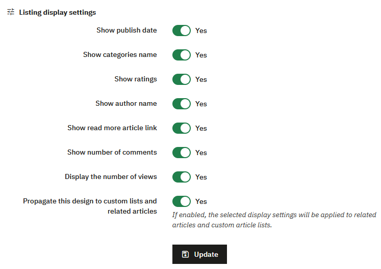
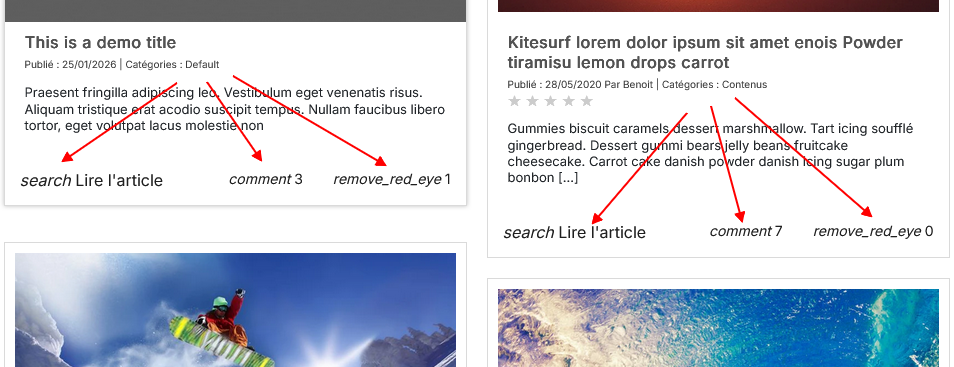
These options allow you to choose which elements are displayed in article lists: publication date, category names, ratings, author, read article link, number of comments, number of views.
An option allows you to propagate this design to custom lists and associated articles. If enabled, the selected display settings will be applied to associated articles and custom article lists.
Customize a Category
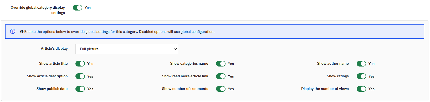
You can define a different display for a specific category, replacing global display settings.
To do this, simply enable the Replace global category display settings option in the concerned category. Disabled options will continue to use the global configuration.
This allows you to display certain categories differently. For example, you can put a category in gallery mode by keeping only the image, or create pages with a specific presentation according to the content type (testimonials, authors, etc.).
Categories Block
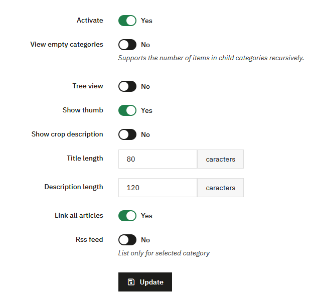
This section allows you to configure the display of the blog categories block.
You can completely enable or disable the block. When active, several options allow you to precisely adjust its behavior and display.
You can choose whether to display empty categories. When this option is disabled, the number of displayed elements takes into account child categories recursively.
The category tree can be displayed or hidden. You can also display category thumbnails and, if necessary, part of their description.
The title length and description size allow you to limit the number of characters displayed. As with other module settings, a value that is too high can weigh down the display, while a reduced value allows for a more compact rendering.
An option allows you to display a link to all articles in the category. The RSS feed can also be enabled. This option only concerns the selected category.
Categories Menu in Blog Pages
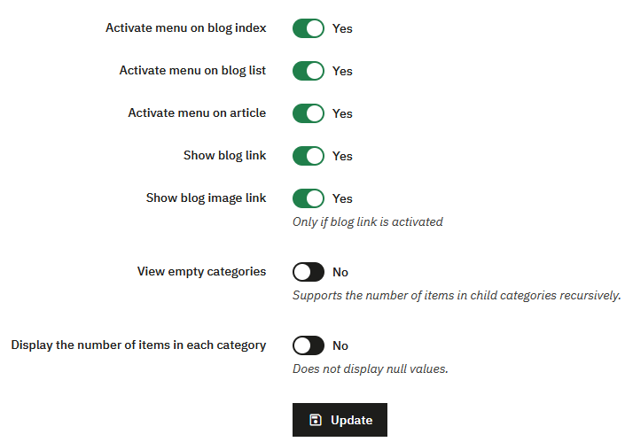
This section allows you to manage the display of the categories menu on all blog pages.
You can enable or disable the menu depending on the context:
- blog homepage
- article lists
- article pages
You can also:
- display a direct link to the main blog page
- display this link as an image
- hide empty categories
- display or hide the number of articles per category
Child categories are displayed as a dropdown menu, for clear and structured navigation.
Top of Category First Page
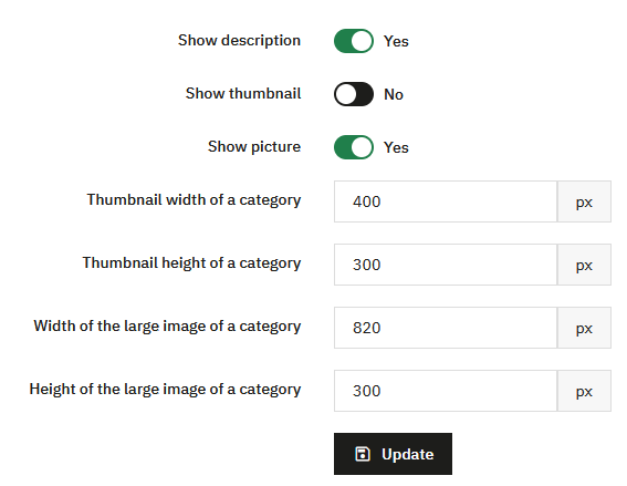
This section allows you to define the display of content at the top of a category's first page, before the article list.
You can display or hide the category description. This option allows you to highlight introductory text, useful for SEO and content contextualization.
The display of the category thumbnail can be enabled or disabled. This thumbnail corresponds to a reduced-size image, generally used for a discreet display.
Another option allows you to display a large image at the top of the category page. This image is intended for a more visual and impactful rendering, for example to highlight a main category or a specific universe.
Image dimensions are fully configurable. You can separately define the width and height of the category thumbnail, as well as the width and height of the large category image.
These settings allow you to precisely adapt the display to the theme design used and ensure visual consistency between different category pages.
Image Configuration
Settings related to image dimensions are also grouped in the Image Sizes section, allowing you to manage all formats from a centralized point.
Comments
PrestaBlog offers two comment systems, but they are not equivalent.
The classic PrestaBlog comment system is best suited for long-term use:
- comments are stored in the site's database
- they are preserved during migrations
- they can be managed directly from the PrestaBlog administration
- the administrator can reply to comments from the back-office
A second system, based on Facebook comments, is also available. It relies on an external service and does not allow any direct comment management from PrestaBlog.
Classic Comments
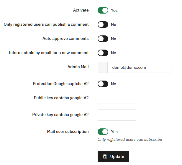
Classic comments are PrestaBlog's native system. They can be fully managed from the back-office and allow the author to reply to comments as the author.
Comment Validation: The "Automatically approve comments" option is strongly discouraged.
- comments are published immediately without control
- the risk of spam or unwanted content is higher
It is recommended to keep manual comment validation.
Antispam Protection and Captcha
PrestaBlog offers two spam protection mechanisms.
Google reCAPTCHA v2
PrestaBlog is compatible with Google reCAPTCHA v2. If you already have an existing reCAPTCHA v2 key, you can use it.
- enter the Google captcha public key
- enter the Google captcha private key
reCAPTCHA v2 deprecated
Google no longer allows (as of January 14, 2026) the creation of new reCAPTCHA v2 or v3 keys and now directs to reCAPTCHA Enterprise. For this reason, using Google reCAPTCHA is no longer recommended for a new installation.
PrestaBlog Antispam (recommended)
A native antispam system is available via Tools > Antispam.
- the system relies on simple questions
- the displayed question is chosen randomly
- no dependency on an external service
- no key to configure
Facebook Comments
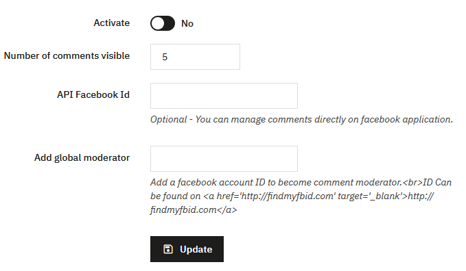
PrestaBlog allows you to use Facebook comments instead of classic comments. However, we advise against its use as it remains proprietary and only appears for logged-in Facebook users (due to GDPR law).
Comments are neither stored nor managed in PrestaBlog, and you cannot reply from the blog either. This system will no longer be updated by our team.
Setup:
- enable Facebook comments in the configuration
- create a Facebook application dedicated to comments
- enter the Facebook API ID in the provided field
- optionally add Facebook moderators
Design
In PrestaBlog, design customization is designed to be durable and compatible with module updates.
It is strongly recommended to use the configuration options provided for this purpose rather than directly modifying or overriding templates or CSS files. Template overrides complicate future updates, require comparing files after each module evolution, and are a frequent source of malfunctions.
The Configuration > Design section allows you to adjust the blog's appearance while maintaining a clean and scalable structure.
It mainly relies on two elements:
- color settings for different blog elements
- custom CSS rules, which allow you to add styles without impacting module files
Color settings allow you to visually refine:
- the blog menu
- pagination
- category listings
- article content
- block content
These settings only concern the visual aspect (colors, backgrounds, hovers) and apply globally.
Changes made in the Design section (colors, custom CSS, category display) may be hidden by an active cache. If you don't see your changes, perform these three actions:
- clear the PrestaShop cache in Advanced Parameters > Performance
- temporarily disable CSS minification in the same page, just long enough to verify the rendering
- force the browser reload with
CTRL + SHIFT + R(Windows) orCMD + SHIFT + R(macOS)
Reminder about category configuration
Category configuration allows you to adjust many display settings related to content (title, description, author, date...). These settings don't directly affect colors but influence the final blog rendering.
Visual Markers
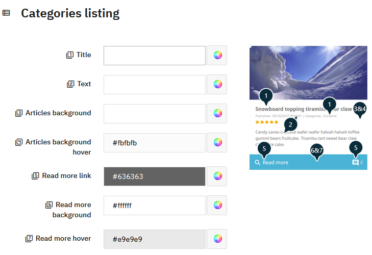
For some more complex elements, PrestaBlog displays an explanatory image next to the configuration fields. These images serve as visual markers to quickly understand which part of the display corresponds to each color field.
- each configuration field is associated with a number
- this number is displayed next to the field
- the same number appears on the preview image
- the visual marker allows you to precisely identify the graphic element concerned
This system allows you to adjust the design in a clear and intuitive way, without modifying the code or risking conflicts during updates.
Custom CSS
PrestaBlog provides a custom CSS field allowing you to add personalized CSS rules without modifying module or theme files.
Rules added via this field are preserved during PrestaBlog updates. This is the recommended method for making CSS adjustments specific to the blog.
As mentioned at the beginning of this section, if your CSS adjustments are not immediately visible, remember to clear the PrestaShop cache, temporarily disable CSS minification, and force the browser cache reload.
Customize category display
The appearance of your categories can be adjusted at two distinct levels, which offers great flexibility depending on whether you want global consistency or specific staging for each category.
Global options in the configuration
The Article list display settings section groups together all settings that apply to all your categories by default: number of articles per page, display of the cover image, summary, date, author, etc. This is the logical starting point for defining a consistent display guideline across your entire blog.
Per-category customization
To go further, each category has its own display options, accessible directly from creating or editing a category. This allows you, category by category, to override global settings: choose a different layout, show or hide certain elements, or define a specific cover image.
This two-level approach — global then local — allows you to efficiently manage a blog with many categories with distinct visual identities.
What about the theme?
The blog display is also influenced by the layout chosen in the theme settings: number of columns, content width, presence of a sidebar… These settings interact directly with how your categories look. Consider reviewing them if you want to adjust the overall structure of your blog.
Image Sizes
This section groups all settings related to images used by PrestaBlog.
You will find settings for:
- article images
- category images
- slideshow images
- associated product images
- author images
These settings define the dimensions and formats used when uploading new images.
To update already published images according to new settings, a complementary tool is available in Tools > Regenerate Images.
Image size configuration and the regeneration tool work together: it is recommended to define these settings as soon as the blog is installed, or to regenerate images if adjustments are made on an existing blog.
How to Identify Image Width
When configuring image sizes, it is important to know the width actually used by your theme in the blog listing.
The following procedure allows you to easily obtain this information, directly from the front-office:
- Go to your blog's homepage, where the article listing is displayed
- Take the first displayed article
- Right-click on this article's title
- Click on "Inspect"
The development tool opens and generally selects the article title. In the code, locate the block just above the title, which contains the image. This block is identified by class="block_top".
Hover over this block in the development tool. The browser then directly displays the block dimensions in pixels on the screen. The displayed width corresponds to the base width used for the image in the listing.
Consider Hover Zoom
Some themes apply a zoom effect on hover for images in listings.
The measured dimension corresponds to the initial display size. On hover, the image is enlarged. To keep a sharp image and avoid any pixelation, it is recommended to use a larger image while respecting proportions.
For example, if the measured width is 400 pixels:
- multiply by 1.5 gives 600 pixels
- multiply by 2 gives 800 pixels
This method allows you to preserve image proportions while ensuring good quality, including on hover.
Finding an Image URL
Images are stored in a subfolder of the active PrestaBlog theme. The path depends on the theme used and the type of image:
Article images:
modules/prestablog/views/img/grid-and-slides/up-img/modules/prestablog/views/img/grid-for-1-7/up-img/
Slideshow images:
modules/prestablog/views/img/grid-and-slides/slider/modules/prestablog/views/img/grid-for-1-7/slider/
Author images:
modules/prestablog/views/img/grid-and-slides/author_th/modules/prestablog/views/img/grid-for-1-7/author_th/
Full URL examples:
https://your-shop.com/modules/prestablog/views/img/grid-and-slides/up-img/thumb_12.webp
https://your-shop.com/modules/prestablog/views/img/grid-and-slides/slider/1.jpg
https://your-shop.com/modules/prestablog/views/img/grid-and-slides/author_th/1.jpg
This path is useful to know in case of migration or backup, to locate and transfer all blog images.